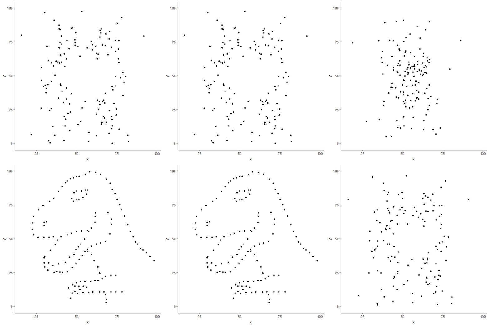
I stumbled upon something funny which I’d like to share. Below is a plot of two different data-sets. One looks like a cute Dino the other more like a Rorschach test. But both have the same values for the mean, the standard deviation and the correlation coefficient.

# Dino
  vars   n  mean    sd median trimmed   mad   min   max range
x    1 142 54.26 16.77  53.33   53.69 15.97 22.31 98.21 75.90
y    2 142 47.83 26.94  46.03   46.90 30.79  2.95 99.49 96.54

# Away
  vars   n  mean    sd median trimmed   mad   min   max range
x    1 142 54.27 16.77  53.34   54.36 21.22 15.56 91.64 76.08
y    2 142 47.83 26.94  47.54   48.23 35.89  0.02 97.48 97.46
This is just one good example why plotting data prior to running statistical test is highly recommendable. If you are interested in the technique behind attaining nearly the same values for different data-sets, I recommend reading the original article. You can find the R package which includes the data on Github.
